
Wednesday, 27 June 2012
Landscape Art
Landscape art is a centuries old art form and one of the most celebrated around today. Almost every Master has painted landscape, and in art's formative period (1600's-1900's)it was one of then only accepted forms of painting.
I did my landscape in the style of van Gogh. I used pastel on sugar paper. I took the picture from a photograph of Tuscany my father had taken.
 I am very pleased with the way my piece turned out. I created it using very small, intense flicks of the pastel, which is very tiring and time-consuming. It's hard to see, but this piece is in fact A1 size, which is an immense area to cover.
I started out by blending and smudging the background colours, which were mostly blue. After this I slowly built up the colours using the flicking technique.
I had to be careful to use the right combination of colours to build an overall impression of one colour; for example sulphur yellow, corn yellow and spring green to create the impression of a field in spring.
I had to spray it several times with fixative in order to stop the immense amount of pastel rubbing off.
All in all I am very pleased with it.
I am very pleased with the way my piece turned out. I created it using very small, intense flicks of the pastel, which is very tiring and time-consuming. It's hard to see, but this piece is in fact A1 size, which is an immense area to cover.
I started out by blending and smudging the background colours, which were mostly blue. After this I slowly built up the colours using the flicking technique.
I had to be careful to use the right combination of colours to build an overall impression of one colour; for example sulphur yellow, corn yellow and spring green to create the impression of a field in spring.
I had to spray it several times with fixative in order to stop the immense amount of pastel rubbing off.
All in all I am very pleased with it.
Friday, 1 June 2012
Final Magazine Layout
I am currently designing my final magazine layout. I am going to base it on the Libyan riots and the magazine layout template I am going to use is this one from Vogue.
 I began with this photo of a woman in the Libyan riots.
 It came out grayscale in photoshop but I decided I liked it more than colour because it has more gravitas.
I tried putting the font in the bottom left corner, as in the inspiration piece, but the overall lightness of the background made the white type hard to read. I tried putting the typography in black but it was even more hard to read because there is more black than white in the background.
Then I selected around the type with the marquee tool. I then created a new layer; selected a light gray from the colour palette dialogue box; and then set the layer mode on difference; then using the paint bucket tool filled the selected area. I then duplicated the chosen text layer; right-clicked 'rasterize text' on the duplicated layer; turned off original text layer via the eye tool; and on the rasterized type layer, cntrl-I to invert the colours. With the bottom word 'freedom' I repeated the first steps and then found that half the text couldn't be read because of dark background; so on the rasterized type layer I used the square marquee tool to create a selection around the word 'freedom' and inverted the selection using cntrl-I. This allows the audience to read the word in the lighter type format.
The third line of words 'to be' I selected the difference-layered box over the word and dragged it down so that half the word was exposed to the lighter background, giving an asethetically pleasing effect. I left some of the words without a layer box because it created contrast and interest.
Then I duplicated the original photograph and inverted it. Then I selected the woman's hands and deleted the inverted layer within the marquee box exposing the inverted background below the original background.
It came out grayscale in photoshop but I decided I liked it more than colour because it has more gravitas.
I tried putting the font in the bottom left corner, as in the inspiration piece, but the overall lightness of the background made the white type hard to read. I tried putting the typography in black but it was even more hard to read because there is more black than white in the background.
Then I selected around the type with the marquee tool. I then created a new layer; selected a light gray from the colour palette dialogue box; and then set the layer mode on difference; then using the paint bucket tool filled the selected area. I then duplicated the chosen text layer; right-clicked 'rasterize text' on the duplicated layer; turned off original text layer via the eye tool; and on the rasterized type layer, cntrl-I to invert the colours. With the bottom word 'freedom' I repeated the first steps and then found that half the text couldn't be read because of dark background; so on the rasterized type layer I used the square marquee tool to create a selection around the word 'freedom' and inverted the selection using cntrl-I. This allows the audience to read the word in the lighter type format.
The third line of words 'to be' I selected the difference-layered box over the word and dragged it down so that half the word was exposed to the lighter background, giving an asethetically pleasing effect. I left some of the words without a layer box because it created contrast and interest.
Then I duplicated the original photograph and inverted it. Then I selected the woman's hands and deleted the inverted layer within the marquee box exposing the inverted background below the original background.
 I am pleased with this final piece. I chose the words 'the only thing to be gained is freedom' because I feel it is a true message. I would not change this.


Cityscape - Independent graphics work

Independent Graphics Work - Unit 12


Chosen Artist Research - Chuck Close
Charles Thomas "Chuck" Close was born July 5, 1940 in Monroe, Washington. He is an American painter and photographer who achieved fame as a photorealist. A spinal artery collapse in 1988 left him severely paralysed, but he has continued to paint and produce work that remains sought after by the entire art world.
Close suffers from a facial recognition disorder (prosopagnosia), meaning that when he sees someone's face, he will not recognise them again, even if he sees them every day. Somehow the features of the face do not fit together as they should but are percieved as different organisms. Close may recognise someone from their body language or unique scent, but he has trouble remembering them by facial recognition techniques, as is usual for the overwhelming percentage of the population. Close says "I was not conscious of making a decision to paint portraits because I have difficulty recognizing faces. That occurred to me twenty years after the fact when I looked at why I was still painting portraits, why that still had urgency for me. I began to realize that it has sustained me for so long because I have difficulty in recognizing faces." By painting portraits he is able to hold on to the face in his mind easier, and recognise the person.
 Although his later paintings were created using a different method from his earlier canvases, the preliminary process remains the same. To create his grid work copies of photos, Close puts a grid on the photo and on the canvas and copies cell by cell. Usually each square within the grid is filled with rough regions of color (usually painted rings) which give the cell an overall hue which makes sense from a distance. His first tools for this included an airbrush, rags, razor blade, and an eraser mounted on a power drill. His first picture with this method was Big Self Portrait, a black and white enlargement of his face to a 2.73 m by 2.12 m canvas, made in over four months in 1968, and acquired by the Walker Art Center in 1969. He made seven more black and white portraits during this period. He has been quoted as saying that he used such diluted paint in the airbrush that all eight of the paintings were made with a single tube of mars black acrylic. Later work has branched into non-rectangular grids, topographic map style regions of similar colors, CMYK color grid work, and using larger grids to make the cell by cell nature of his work obvious even in small reproductions. The Big Self Portrait is so finely done that even a full page reproduction in an art book is still indistinguishable from a regular photograph.
 On December 7, 1988, Close felt a strange pain in his chest. At that moment he was due at a ceremony honoring local artists in New York City and was waiting to be called to the podium to present an award. Close delivered his speech and then went across the street to Beth Israel Medical Center where he suffered a seizure which left him paralyzed from the neck down. The cause was diagnosed as a spinal artery collapse. Close called that day "The Event". He has relied on a wheelchair since.
Astonishingly, however, Close continued to paint with a brush strapped onto his wrist with tape, creating large portraits in low-resolution grid squares created by an assistant. Viewed from afar, these squares appear as a single, unified image which attempt photo-reality, albeit in pixelated form. Although the paralysis restricted his ability to paint as meticulously as before, Close had, in a sense, placed artificial restrictions upon his hyperrealist approach well before the injury. That is, he adopted materials and techniques that did not lend themselves well to achieving a photorealistic effect. Small bits of irregular paper or inked fingerprints were used as media to achieve astoundingly realistic and interesting results. Close proved able to create his desired effects even with the most difficult of materials to control.
On December 7, 1988, Close felt a strange pain in his chest. At that moment he was due at a ceremony honoring local artists in New York City and was waiting to be called to the podium to present an award. Close delivered his speech and then went across the street to Beth Israel Medical Center where he suffered a seizure which left him paralyzed from the neck down. The cause was diagnosed as a spinal artery collapse. Close called that day "The Event". He has relied on a wheelchair since.
Astonishingly, however, Close continued to paint with a brush strapped onto his wrist with tape, creating large portraits in low-resolution grid squares created by an assistant. Viewed from afar, these squares appear as a single, unified image which attempt photo-reality, albeit in pixelated form. Although the paralysis restricted his ability to paint as meticulously as before, Close had, in a sense, placed artificial restrictions upon his hyperrealist approach well before the injury. That is, he adopted materials and techniques that did not lend themselves well to achieving a photorealistic effect. Small bits of irregular paper or inked fingerprints were used as media to achieve astoundingly realistic and interesting results. Close proved able to create his desired effects even with the most difficult of materials to control.


Friday, 11 May 2012
The Face Magazine
The Face was a British music, fashion and culture monthly magazine started in May 1980. Its best selling period was in the mid-1990s, when editor Richard Benson brought in a team that included art director Lee Swillingham. Benson ensured the magazine's written content reflected developments in music, art and fashion whilst Swillingham changed the visual direction of the magazine to showcase new photography. By the time of its May 2004 closure, monthly sales had declined and advertising revenues had consequently reduced. The publishers EMAP soon closed the title in order to concentrate resources on its more successful magazines. In an ironic twist, Jason Donovan led a consortium that made an abortive approach to EMAP to save the title prior to its closure. In 2011 The Face was added to the permanent collection of the Design Museum, London, and featured in the Postmodernism exhibition at the V&A.
 This risque picture of Gisele Bündchen on The Face in the 90's. The police tape reflects conflict and the barely-covered woman is perhaps reflective of the conflict inside herself.
 Madonna on the cover of The Face. This image is reflective of conflict because Madonna is wearing a scowl and clothing which is traditionally threatening. The colours are conflicting; they only use red, white, black and navy blue. It makes it look harsh.


WET Magazine
WET: The Magazine of Gourmet Bathing was one of the most 'seminal' publications of the 1970s and early 80s. Founded by Leonard Koren in 1976 it ran thirty-four issues before closing in 1981. The idea for the magazine grew out of the artwork Leonard Koren was doing at the time—what he termed ‘bath art’—and followed on the heels of a party he threw at the Pico-Burnside Baths.
WET covered a range of cultural issues and was widely known for its use of graphic art. Started as a simple one-man operation that included artwork and text solicited from friends and acquaintances, the production, team, and circulation of the magazine would grow over the years. Its content also evolved to cover a wider expanse of stories that captured a smart and artsy Los Angeles attitude that was emerging at the same time as punk, but with its own distinct aesthetic. The magazine’s energetic creativity and flair for the absurd would remain a constant. As design problems arose, solutions were often improvised on the spot, creating a quirky editorial sensibility that remains one of WET's most enduring legacies. Its layout and design helped to catalyze the graphic styles later known as New Wave and Postmodern.
 WET's covers always looked slightly weird, possibly due to the fragmented editorials. I think they look quite conflicted, as though several artists wanted to do several other things with it but were overruled. I feel that the mood of the artists influenced the front covers very much.
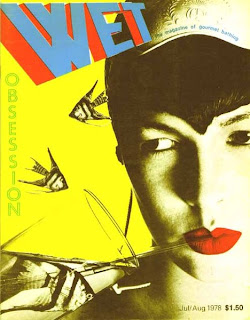
I think the yellow cover is the most conflicted because there are so many warring elements. Also the woman's eyes go sideways and she looks angry. The birds flying around her look like aeroplanes, a powerful war symbol.
WET's covers always looked slightly weird, possibly due to the fragmented editorials. I think they look quite conflicted, as though several artists wanted to do several other things with it but were overruled. I feel that the mood of the artists influenced the front covers very much.
I think the yellow cover is the most conflicted because there are so many warring elements. Also the woman's eyes go sideways and she looks angry. The birds flying around her look like aeroplanes, a powerful war symbol.


Retro Style

David Foldvari - Big Active
David Foldvari was born in Budapest, Hungary, but has lived in the UK for the last 20 years. His work often tackles issues of alienation, identity and belonging, formed by a preoccupation with his eastern European roots, combined with his experience of growing up in the UK. David's work is bold, darkly humorous and often political in tone; his draftsmanship has led to a prolific output both personally and commercially. Some of his previous clients include the New York Times, Greenpeace, Random House, Penguin Books, Dazed & Confused and Island Records.
 Foldvari has used Photoshop and draughtmanship with an ink pen to create this. The work is dark but still fun; the man with a rifle framed by bright colours and splashes. I think Foldvari is trying to say that war doesn't always need to be serious and that even the opposite side are human beings.
It is nicely balanced with the block black man on the right and then the colours ballooning out of him across the page.
The whole piece is focused on the gun. It pokes out unsurrounded by anything, black on a cream page, a focus point. For most of us guns, especially heavy-duty AKs like this man has, are accompanied by a host of negative connotations. However, Foldvari does nothing to take the focus away from the gun, as he has with the negative headscarf and Arabic features. These things also have negative conditioning in the mind of the public.
Foldvari has used Photoshop and draughtmanship with an ink pen to create this. The work is dark but still fun; the man with a rifle framed by bright colours and splashes. I think Foldvari is trying to say that war doesn't always need to be serious and that even the opposite side are human beings.
It is nicely balanced with the block black man on the right and then the colours ballooning out of him across the page.
The whole piece is focused on the gun. It pokes out unsurrounded by anything, black on a cream page, a focus point. For most of us guns, especially heavy-duty AKs like this man has, are accompanied by a host of negative connotations. However, Foldvari does nothing to take the focus away from the gun, as he has with the negative headscarf and Arabic features. These things also have negative conditioning in the mind of the public.

My Focus.
My piece is going to be about the riots across the world. Especially focusing on Egypt 2012/12 and London 2011.
First Magazine Layout Design


Jasper Goodall
Jasper Goodall was born in 1973 in Birmingam, England.
His Father was an architect and his mother a fine artist and photographer who was instrumental in the UK Feminist Arts Movement during the 1970’s/80’s.
He Graduated from The University of Brighton in 1995.
Goodall was at the forefront of the reinvention of illustration in the late nineties and helped pave the way for the resurgence of the medium that Britain has witnessed in the last ten years. His work for The Face magazine has influenced many image makers. In addition to his normal work he teaches on the illustration degree course at the University of Brighton.


Visual Language of Typography
I am looking at how typography gives off a certain mood. For this lesson I will choose five themes and then find typography I think most accurately reflects them.
 This typography represents horror. We are used to seeing this type of typography on the face of films such as Saw and 28 Days Later. The blurry letters and the stripy blocks give the impression of the letters blinking in and out of existence... Just as the TV screens in horror films do.
 Brush writing has long been associated with love. The effort in producing a long letter written by brush is a real labour of love, and the typeface recalls the characteristically romantic Heian period of Japan. In this period it was fashionable to write small stanzas of poetry to friends, lovers and family. The subtle Japanese could interpret all sorts of meanings in the metaphorical poetry, and elegant brushstrokes were the mark of a true noble.
 This typography represents calmness to me. A steady hand is needed to draw the calligraphic letters and someone in the grip of a strong emotion would not manage it. The script reminds me of schoolteacher's hand; a calm, collected young woman who teaches toddlers their letters. Probably in the West and then falls in love with the village blacksmith and lives happily ever after, probably ignoring the advances of a rich young man. Or whatever.
 This one is supposed to feel like a machine or a robot. This reminds me of machines because the display on clocks and less developed computers is like this. It is a quite mechanical feel to it; the rigid, formed letters and the segmented pieces don't look as though they are done by hand.
 This reminds me of conflict because it looks like army writing, on the side of boxes. I think it would probably remind most people of war because they have seen it in films. The chunkiness of the words reminds me of solidity and impossibility to die. I think it reminds me a lot of the words on the side of tanks.

Josh Vanover
Josh Vanover is a graphic designer who was born and raised in North Carolina. His graphic work is characterised by black and white colouring and a density of value. His style is informed by an encyclopaedic knowledge of visual sources ranging from cult film footage, erotica and video stills to cartoons, war photography and even psychedelic. Vanover’s signature style and workman-like approach have attracted the attention of clients such as Nike, Stussy and Hennessy, and most recently he has done album artwork for the likes of Linkin Park.


Typography Styles
Ideas For Magazine Layouts - Looking At Vogue


David Carson

he changed the public face of graphic designnewsweek


Fringe Postcards - girl on a wall

Fringe Postcards - Running Woman

Fringe Postcards - Kitty Cointreau

Fringe Postcard Designs

Friday, 23 March 2012

In-Depth Study On Photorealism.

Photorealism is an art movement based on the study of a photograph and then production, from this, of a painting which is so realistic that it resembles a photograph. As a rule, paintings done in the United States in the late 1960s or early 1970s in this style are generally called original photorealism.
Photorealism evolved from Pop Art, mainly in America. The Photorealists opposed the increasingly popular Minimalist and Abstract Impressionist art movements, also evolving at the time. The general idea was to counter the rise of the sleek lines and abstraction of the movements currently in favour.
The whole point of photorealist painting was to have a photograph. The subjects must be still and unchanging; the idea behind it was a capturing of the current space in time. The photograph was still on the rise in art then, the Polaroid was coming into vogue, and photography had not yet become an accepted art form. The photorealist artist would take a still photograph and then develop the photo in order to transfer it by hand onto a canvas, and paint it. Nowadays we can print straight on to canvas, and this was the very thing the photorealists were rebelling against; the influx of technology into art, which is a paradox, as without technology, their art form would never have existed. The whole style is precise and intense, with natural lines and colours. Technical mastery was key; without a keen grasp of mark-making techniques, the artist would fail in his or her attempts to produce photorealist work.
The term photorealist came from Louis Meisel, who developed a five-point definition of a photorealist artist, seen below:
1. The Photo-Realist uses the camera and photograph to gather information.
2. The Photo-Realist uses a mechanical or semimechanical means to transfer the information to the canvas.
3. The Photo-Realist must have the technical ability to make the finished work appear photographic.
4. The artist must have exhibited work as a Photo-Realist by 1972 to be considered one of the central Photo-Realists.
5. The artist must have devoted at least five years to the development and exhibition of Photo-Realist work.
An example of original photorealist, American painters would be: Chuck Close, Ralph Goings, Charles Bell, Audrey Flack, Tom Blackwell, and Glenray Tutor, to name a few. The original movement was fairly small and captained mostly by artists who have now moved on to other things; Flack, for instance, moved into sculpture.
Photorealism is no longer merely an American movement. Beginning with Swiss artist Franz Gertsch in the 1980's, photorealism spread across Europe. However, it will still always be associated with America, and indeed most photorealist paintings today protray vintage American scenes.
Friday, 16 March 2012
Web Designer
Web design is a broad term covering many different skills and disciplines that are used in the production and maintenance of web pages. The different areas of web design include; web graphic design, interface design; including standardised code and proprietary software, user experience design and search engine optimisation. Often web designers will work in teams covering different aspects of the design process, although some designers will cover them all. The term web design is normally used to describe the design process relating to the front-end (client side) design of a website including writing mark up, but this is a grey area as this is also covered by web development. Web designers are expected to have an awareness of usability and if their role involves creating mark up then they are also expected to be up to date with web accessibility guidelines.
Games Design

Games design is the act of designing games. It is considerably more detailed and hard than anything we've looked at so far; games designers have to be well trained and know their way around programs.
Assassin's Creed, Fallout New Vegas, Call of Duty, and Black Ops are all examples of fully-designed games.
Logo Design
Logo design is basically designing a logo for a company. Generally the logo is simplistic and stands out to catch people#s eye. Examples of well-known logos are the Nike brand, Rolls Royce, Mercedes Benz, Tesco, and Samsung.
List of Resources for Graphic Design

1. computer
2. scanner
3. hard drive
4. memory stick
5. card reader
6. internet access
7. camera
8. Photoshop
9. mobile phone
I use Adobe and Photoshop PS3.
Subscribe to:
Posts (Atom)